Case Study · Workflow Design
Reimagining Enterprise Workflow Configuration
Transforming a legacy table-based experience into a visual workflow canvas with the PULSE Design System.
Project snapshot
One of the biggest usability challenges across the legacy ValGenesis platform was configuring review and approval workflows. Although workflows sat at the center of regulated business processes, the configuration experience looked and behaved like a spreadsheet: users were expected to understand an entire business process by reading rows in a table. As products grew more complex, workflows expanded from two or three reviewers to dozens of review groups, conditional approvals, serial stages, and parallel branches, and the legacy UI simply couldn't communicate that complexity. When SmartGxP was being designed, this became one of the flagship opportunities for PULSE: instead of treating workflow as form data, we redesigned it as something users could actually see.
My role: I designed the visual workflow canvas and reusable workflow card architecture, from early research through the final interaction model, working closely with product and engineering to align it with SmartGxP's architecture.
Configuring a process felt like editing a spreadsheet
The old platform relied on multiple editable tables. Users configured a Review Group, Functional Role, Review Period, Alert Frequency, and Mode (Serial / Parallel), all of it living as rows with no representation of relationships, no visualization, and no indication of progression. A user configuring ten review groups had to mentally build the workflow inside their head.
Invisible flow
The table showed data, never process. Which reviewer comes first, which approvals happen together, where the workflow ends: none of it was answerable from the screen.
Serial vs. parallel was abstract
The most important decision in the whole workflow lived in a tiny segmented control. Changing it fundamentally altered the workflow, yet nothing visually changed.
High cognitive load
Every row depended on every other row. Users had to hold execution order, dependencies, and review timing in their head just to edit a single field.
No spatial understanding
Humans understand relationships spatially. The interface represented them textually, and that mismatch dramatically increased the effort required to reason about a workflow.
Poor discoverability
There were no visual affordances for adding branches, inserting reviewers, or understanding hierarchy. Everything required knowing hidden business rules in advance.
Impossible to validate
Before saving, there was no way to answer "is this workflow actually correct?" Users often exported workflows or redrew them elsewhere just to check.
“A user configuring ten review groups had to mentally build the workflow inside their head.”
Observed pattern, legacy workflow configuration
Users never talked about rows
Observing internal users and implementation consultants surfaced a consistent pattern: people rarely spoke about rows. Left to describe a workflow in their own words, they reached for diagrams and spatial language every time.
Their mental model was always visual. The interface wasn't.
“Let users build workflows the same way they think about them.”
Six principles behind the redesign
Rather than improving the table, we challenged the assumption that workflows should be configured inside one. Six principles guided everything that followed.
P01
Make process visible
The workflow itself becomes the interface, not a summary of one.
P02
Reduce cognitive load
Remove the need to mentally reconstruct the process from disconnected rows.
P03
Direct manipulation
Users manipulate workflow objects directly instead of editing table cells.
P04
Progressive configuration
Configure only the selected item. Don't surface every property at once.
P05
Reusable pattern
One canvas for configuration, monitoring, approvals, and audit history.
P06
Visual status over discovery
Status is visible immediately, not discovered only after saving it.
From table rows to a workflow canvas
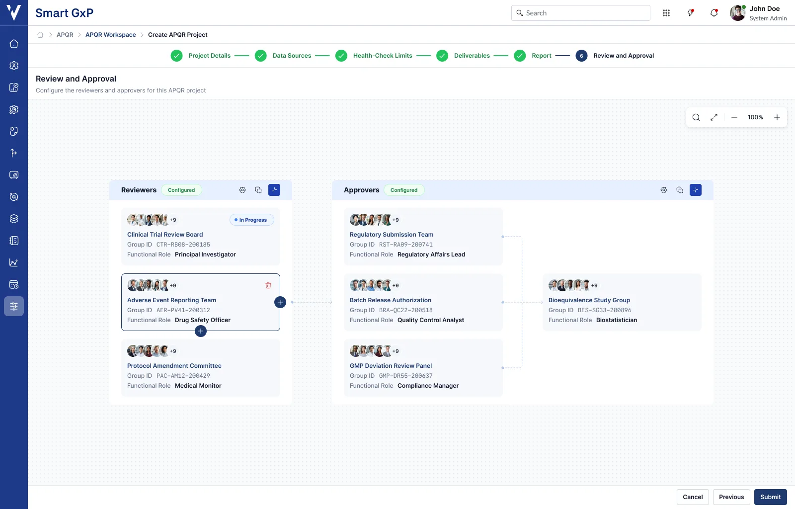
Each review group became an independent workflow card instead of a row. Cards represent actual workflow stages, and users immediately understand order, hierarchy, dependencies, and relationships without reading a single table.
The canvas communicates Reviewers → Approvers → Final Approval on its own, without requiring labels or documentation.
Cards represent real work
Connections replace assumptions
Workflow relationships are drawn, not implied. Serial flows become visible, parallel branches become obvious, and dependencies become understandable at a glance instead of imagined from a legend.
Right configuration panel
Configuration moved into contextual editing: selecting a workflow node opens a property panel for that node alone, so users configure Business Unit, Group, Functional Role, Review Duration, and Alert Frequency without losing workflow context.
Only the selected workflow item exposes editable properties. Everything else stays simplified, which keeps the canvas clean regardless of how large the workflow grows.
Add anywhere
Instead of scrolling to the bottom of a table, users click a plus icon exactly where they want to insert a stage, following interaction patterns already familiar from tools like these.
A better mental model
Legacy thinking
Row 7
SmartGxP thinking
This approval happens after QA.
The interface now matches how users actually think.
The transformation at a glance
Layout model
Table
Visual canvas
Configuration unit
Rows
Workflow cards
Relationships
Text relationships
Connected nodes
Process visibility
Hidden flow
Visible flow
Editing model
Spreadsheet editing
Direct manipulation
Configuration
Abstract configuration
Visual configuration
Interaction
Static form
Interactive canvas
Cognitive load
High cognitive load
Low cognitive load
A new pattern inside PULSE
This project grew far beyond redesigning one screen. It introduced an entirely new interaction pattern into PULSE, one every SmartGxP application now shares.
Workflow canvas pattern
Reusable layout system for process-based experiences across the platform.
Workflow cards
Standardized node component supporting avatars, status, and configuration state.
Workflow connectors
Consistent relationship visualization shared across every canvas implementation.
Status badges
Configured, Pending, Active, Completed, Rejected, and In Review, all on shared design tokens.
Workflow properties panel
Reusable right-side configuration experience for editing a selected node in context.
Interaction guidelines
Defined insertion behavior, hover states, drag targets, connection rules, node spacing, and accessibility.
Status badges
Extending beyond configuration
One of the biggest architectural improvements was that the workflow canvas wasn't limited to setup. The same visualization now appears throughout SmartGxP, so the workflow itself became a reusable information model rather than a one-time configuration screen.
The same task, two very different journeys
Compressing the legacy experience and the SmartGxP experience into the same seven-step frame makes the shift obvious.
Legacy platform
Open workflow
Read table
Find reviewer
Identify serial row
Compare with previous row
Guess next stage
Hope configuration is correct
SmartGxP
Open workflow
See visual process
Click stage
Configure properties
Connect workflow
Done
Why each decision was made
Cards instead of rows
Cards create ownership. Each stage feels like an independent object rather than spreadsheet data.
Connections instead of numbers
Relationships should never require interpretation. They should be visible.
Canvas instead of form
Processes deserve spatial representation, not a column of inputs.
Context panel instead of modal
Editing should never hide the workflow the user is trying to understand.
Visual status over discovery
Status is visible immediately, not discovered only after saving it.
One canvas, not many screens
The workflow canvas became a reusable model, not a one-time configuration screen.
Accessibility improvements
Compared to the legacy platform, the redesign also meaningfully improved accessibility.
Larger interaction targets
Clear focus states
Better contrast
Reduced eye movement
Stronger information hierarchy
Better scanning
Less dependence on memory
Consistent interaction patterns
What the redesign changed
Although originally scoped to improve one feature, the redesign ended up influencing the entire SmartGxP platform.
Improved learnability
New users understood workflows within minutes instead of requiring documentation.
Reduced configuration errors
Visual relationships significantly reduced mistakes from incorrect serial and parallel assignments.
Faster workflow creation
Users configure complex workflows in fewer interactions, without mentally mapping rows into a process.
Increased confidence
Users can validate a workflow simply by looking at the canvas before saving it.
Cross-product consistency
Because the canvas is part of PULSE, every SmartGxP application now shares the same workflow model.
Improved accessibility
Larger targets, clearer focus states, and stronger contrast made the canvas easier for everyone.
My role
As the UX Designer, I:
- Identified the limitations of the legacy interaction model
- Designed the end-to-end interaction model, from early research to final patterns
- Designed the visual workflow canvas and reusable workflow card architecture
- Built reusable interaction patterns for the workflow card component
- Defined component behavior, spacing, states, and configuration guidelines
- Collaborated with product and engineering to align the experience with SmartGxP's architecture
- Documented the pattern so other teams could reuse it in their own applications
Reflection
This project is one of the clearest examples of how design systems can drive product innovation, not just visual consistency. The legacy platform treated workflows as data to be edited. Through SmartGxP and PULSE, we reframed workflows as experiences to be understood.
By replacing spreadsheets with a visual canvas, we aligned the interface with users' mental models, reduced cognitive load, improved confidence, and created a scalable interaction pattern that now serves as a foundational building block across the SmartGxP ecosystem.
The outcome wasn't just a better screen. It established a new standard for how enterprise workflows are created, visualized, and experienced across the entire platform.