Case Study · No-Code Configuration
Rebuilding a legacy form builder into a single-view configuration experience
Form Builder configures the forms behind regulated pharmaceutical workflows. It worked, but a legacy architecture and a multi-screen interaction model made it slow to use and expensive to extend. I designed the single-view WYSIWYG workspace that replaced it, built on PULSE.
Project snapshot
Form Builder is a core configuration tool inside SmartGxP, used by administrators and validation teams to create the forms that run across regulated pharmaceutical workflows. The goal was not to modernize the interface. It was to rethink the interaction model underneath it so the experience could scale with the product.
My role: I designed the interaction model, the field and properties architecture, and the PULSE integration that replaced the builder's custom UI, working from research gathered with product, engineering, implementation, and customer success.
A working builder, held back by what it was built on
The builder worked. The constraint was everything around it: an architecture that made new field types expensive, and an interaction model that split a single task across several screens. In an environment where accuracy and traceability are the point, that friction is costly.
Legacy architecture
Built on older frameworks with limited component flexibility. New interaction patterns or field behaviors took significant engineering effort.
Poor discoverability
Configuration options were spread across different areas of the interface, so field-specific settings were hard to locate.
Inefficient creation
Creating and configuring a field meant multiple steps and constant navigation between separate parts of the interface.
Limited scalability
The interaction model was tightly coupled to the implementation, which made new field types and dynamic behaviors difficult to add.
Inconsistent patterns
Field types behaved differently and exposed their settings differently, raising both the learning curve and the error rate.
Understanding before designing
The redesign started as a structural question, not a visual one. Before proposing an interface I mapped the business requirements, technical constraints, user workflows and compliance rules that shape how forms actually get built.
Stakeholder interviews
Business requirements, technical constraints, implementation cost and compliance considerations, from the people who carry each of them.
The existing builder was expensive to extend.
Design impact
A modular component architecture, with field configuration decoupled from the canvas.
Customers kept requesting new field types and dynamic behaviors.
Design impact
A properties panel that absorbs field-specific configuration instead of new screens.
Configuration complexity was pushing out implementation timelines.
Design impact
Fewer steps, with frequent actions moved next to the field being edited.
The grid-based control model was built around implementation, not document structure.
Design impact
Dropped the legacy grid controls in favour of a flexible canvas layout.
User interviews
Conversations with the people who configure and maintain forms, about where the time actually goes.
Form creation took too long, with constant movement between creation, configuration and layout.
Design impact
A drag-and-drop editor that keeps building and organizing inside one workspace.
Layout management was confusing: controls did not obviously map to the final structure.
Design impact
A WYSIWYG canvas that represents the finished form while it is being built.
Settings were difficult to locate, and where they lived depended on the field type.
Design impact
One properties panel, with a consistent structure for every field type.
Who builds the forms
Two roles with different jobs in the same tool: one configuring forms against changing processes, the other making sure what those forms capture stays traceable.
James Smith
System Administrator
Pharmaceutical manufacturing · 10 years with compliance systems
Goals
- Configure forms for validation workflows
- Keep collected data aligned to compliance requirements
- Modify forms quickly when a process changes
- Minimize configuration errors
Frustrations
- Hard to visualize the final form layout
- Too many steps to configure a field
- Field settings are difficult to locate
- Repetitive configuration workflows
Design response
- WYSIWYG canvas
- Sees the form's structure while building it.
- Centralized properties
- Configuration lands in one predictable place.
- Inline field actions
- Fewer steps to change an individual field.
Pradeepa
Validation Engineer
Life Sciences · 5+ years in validation documentation
Goals
- Capture structured, traceable validation data
- Keep documentation audit-ready
- Map fields correctly to compliance data
- Reduce manual data entry
Frustrations
- Forms require too many manual entries
- Hard to integrate system-generated values
- Layout inconsistencies make forms harder to review
- Complex configuration invites errors
Design response
- Dynamic lookup fields
- Fields connect directly to system entities.
- System-generated values
- The platform supplies values instead of the user retyping them.
- Structured canvas
- Hierarchy and field relationships read visually.
Measuring the legacy builder against the basics
I audited the legacy builder against standard usability heuristics before committing to a new interaction model, so the redesign answered documented problems rather than taste.
Visibility of system status: nothing indicated which field was selected or being configured.
Design fix
Explicit selection states, with the active field highlighted on the canvas.
Consistency and standards: each field type exposed its settings through a different pattern.
Design fix
One properties panel structure, shared across every field type.
Efficiency of use: the same configuration actions repeated across fields and screens.
Design fix
Contextual inline actions, and far less navigation between screens.
Error prevention: fields could be misconfigured with no view of the resulting layout.
Design fix
Configuration relationships made visible, with the form structure readable while building.
From a fragmented workflow to one continuous experience
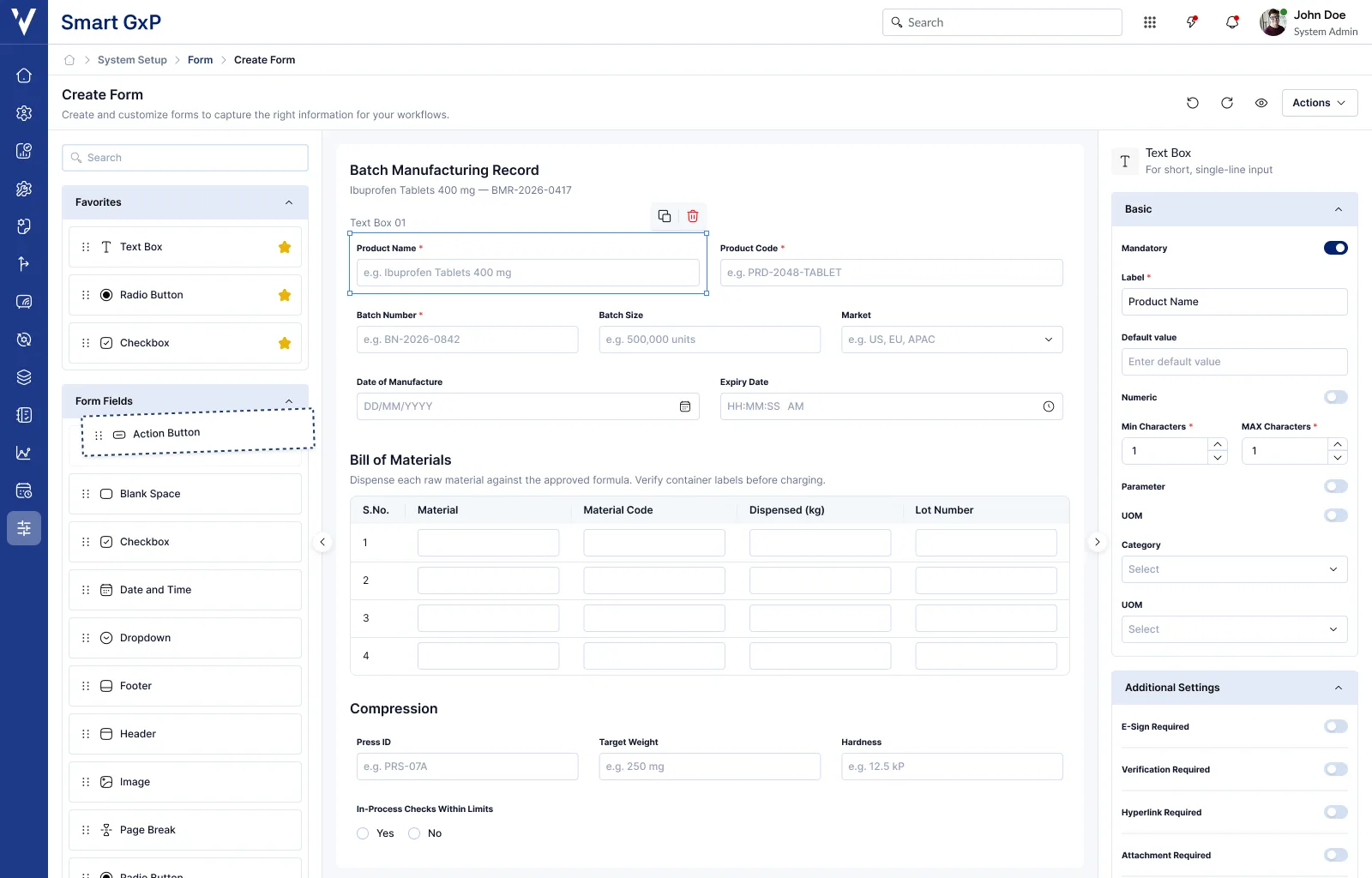
The largest decision was collapsing the multi-screen workflow. Field creation, configuration and layout used to be three separate activities. They became one.
Add a field
Pick from the field library: text, dropdown, radio, lookup, date, number and more.
Configure
Set label, default value, required state, entity mapping and field-specific behavior.
Arrange
Drag fields onto the canvas and reorder them into the intended document structure.
Save or publish
Keep it as a draft, or move forward toward publishing and validation.
The mental model changed
Legacy builder
Create
Navigate
Configure
Return
Rearrange
Redesigned builder
Add
Configure
Arrange
Continue
The gain is not a shorter list. It is that the loop back to the start disappears, and with it most of the context switching.
One workspace, three areas
The builder resolved into three areas, each with exactly one job.
Field library
An explicit entry point for adding fields, so what is available is visible rather than buried behind menus.
Form canvas
The primary workspace: add, reorder, select, act on fields, and watch the form take its final shape as you build.
Properties panel
The single source of truth for configuration. Selecting a field opens its settings in the same place every time.
The builder had to support what comes next
The harder problem was designing past the current requirements. New field types, dynamic behaviors, lookup relationships, system-generated values and future validation rules all had to land without inventing a new pattern each time.
One framework every field type inherits, exposing only the configuration relevant to it. New capabilities extend the model instead of replacing it, so users are not relearning the builder every release.
Built to absorb
Building on PULSE
The legacy builder ran on custom, inconsistent UI. The redesign was the opportunity to move it fully onto PULSE, the ValGenesis design system, rather than rebuilding each component on its own again.
Standardized through PULSE
Standardized components
One reusable set across inputs, panels, dialogs and interaction states.
Faster development
Engineering assembled existing components instead of recreating UI for every feature.
Scalable architecture
New field types and configuration patterns arrive without a separate visual language.
Consistent experience
The builder reads as part of SmartGxP rather than an isolated legacy module.
The transformation at a glance
| Dimension | Legacy builder | Redesigned builder |
|---|---|---|
| Workflow | Multi-screen: create, navigate, configure, return | Single-view workspace, start to finish |
| Configuration | Scattered across different areas of the interface | Centralized properties panel |
| Layout | Grid-based controls built around implementation | WYSIWYG canvas built around document structure |
| Field settings | Inconsistent, different per field type | One consistent configuration model |
| Extensibility | New field types need bespoke interaction work | Modular field architecture, inherited patterns |
| Context switching | Heavy navigation between separate screens | Contextual inline actions on the canvas |
| Output preview | Difficult to visualize the finished form | Real-time visual representation while building |
| Components | Custom, one-off UI patterns | 100% PULSE components |
What the redesign changed
The redesign moved on four fronts: efficiency, adoption, scalability and consistency.
Efficiency
- 40% less time to create a form
- Configuration steps down from 5+ to 3
- The core workflow contained in one workspace
Adoption
- Shorter learning curve for new administrators
- Less dependency on formal training
- Positive feedback through internal validation and QA
Scalability
- New field types follow an established pattern
- Properties panel scales to dynamic configuration
- PULSE components remove repeat UI work
Consistency
- Fully aligned with PULSE
- Shared interaction patterns across SmartGxP
- Fewer UI-related support issues
Five principles this project established
Five principles came out of this project and carried into other configuration-heavy work across SmartGxP.
Keep configuration next to the object
Users should not have to leave an object's context in order to configure it.
Make complexity progressive
Expose the configuration needed now, and keep advanced options contextual.
Design for what is coming
New functionality should extend the established interaction model, not introduce another one.
Make the output visible
For document and form configuration, the result should be readable while it is being built.
Reuse the system, not just components
PULSE supplies interaction, spacing, type and state patterns, not only a component library.
The redesign was never about the UI
Modernizing a legacy product is rarely a matter of changing its UI. Every improvement that mattered here came from questioning the workflow underneath it first.
The redesign turned a technically constrained, multi-step configuration workflow into a single-view building experience. It improved the day-to-day for administrators, and it answered the deeper problem: an architecture that lets both the users and the product keep scaling.