Case Study · Design Systems
Scaling design consistency with the PULSE Design System
How a centralized enterprise design system brought consistency, efficiency, and alignment across more than ten product teams, and became the single source of truth for how ValGenesis builds products.
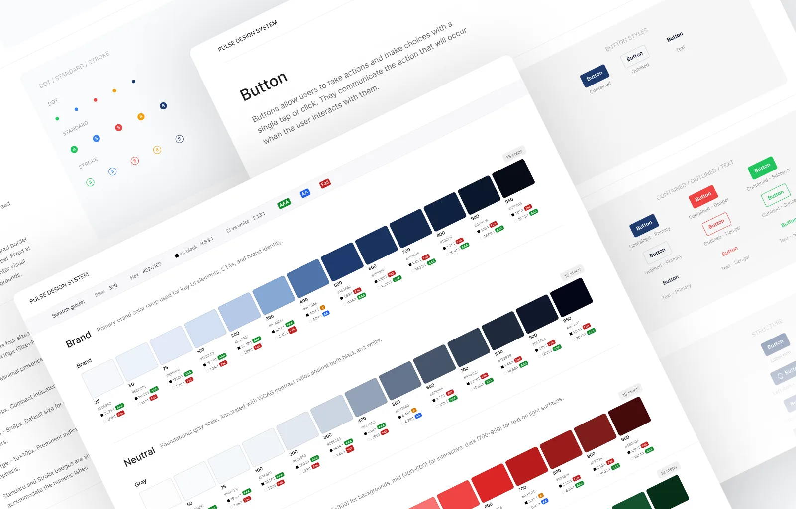
Project snapshot
PULSE was initiated to address fragmented design practices and inconsistent user experiences across products. The project brought together designers and engineers to create a shared design system that streamlined workflows, improved cross-team collaboration, and enabled faster delivery. Over time, PULSE became the single source of truth for building consistent, scalable product experiences.
Tools
The problem
As the organization scaled rapidly over five years, more than 10 product teams were designing and building features independently. Without a shared system, this resulted in fragmented user experiences and growing inefficiencies across the platform.
Process
Eight phases, from discovery to an adoption effort that's still measured and iterated on today, and the work to make the system legible to AI tools. Expand each for what actually happened.
Product audit & reverse brainstorming
Before initiating the design system, a comprehensive audit was conducted across existing product experiences, with a strong focus on how components were being used in real scenarios. The goal was to uncover inconsistencies, misalignments, and usability gaps across products, and to build a clear understanding of the current system landscape before defining a new one.
Audit approach
Reviewed product screens with design and engineering
Mapped component usage across key workflows
Identified inconsistent and missing UI patterns
Captured notable edge cases and variations
Audit artifacts
Repository of real component usage examples
Snippets highlighting key UI inconsistencies
Comparisons of similar patterns across products
List of gaps requiring standardization
Why this mattered
This audit created a shared, evidence-based understanding of the problem space. It not only informed the foundations of PULSE but also helped communicate the need for a unified system to stakeholders.
- Prioritize high-impact areas for standardization
- Align teams on existing pain points
- Strengthened the case for adoption

Reverse brainstorming
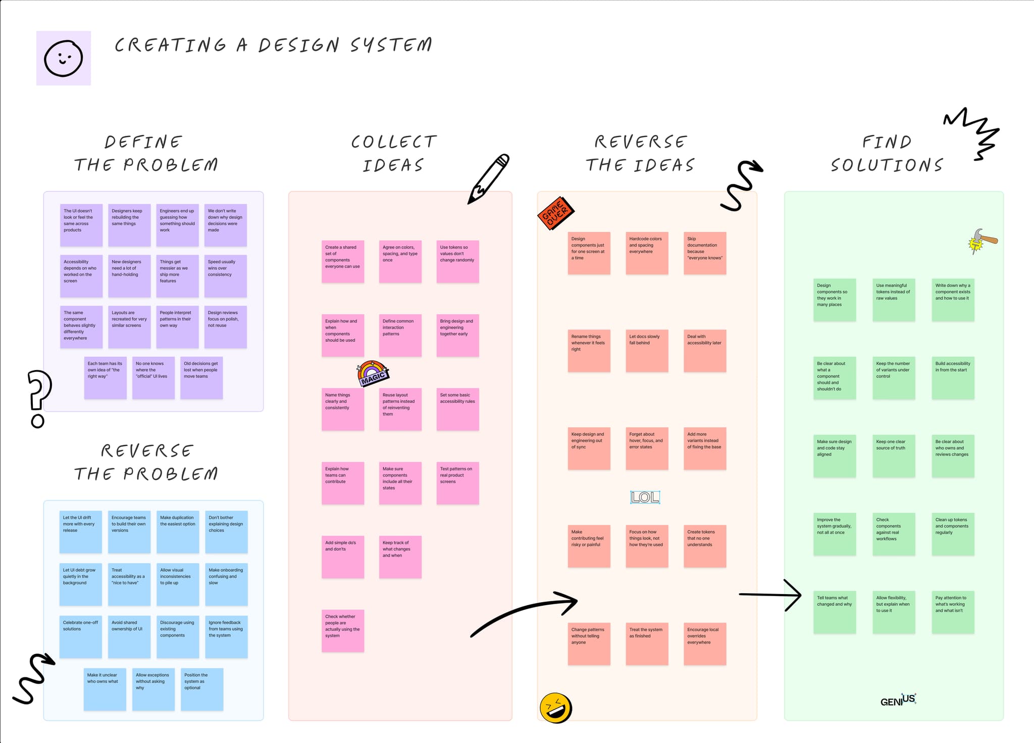
To validate early assumptions, a reverse brainstorming exercise was conducted to explore how the design system could fail at scale by asking “how might this system break or be ignored.”
These insights reinforced the need for flexibility alongside consistency, clearer documentation, and lightweight governance. As a result, PULSE was shaped to be more adaptable, easier to adopt, and designed to evolve with real product needs rather than enforce rigid rules.
Giving the system a name
A system that more than ten teams are expected to adopt needs a name people will actually say out loud. Ours had to carry the ambition too: a foundation for a seamless, efficient, scalable digital ecosystem, and a shared vision that designers and engineers could both stand behind. We landed on PULSE, the heartbeat of design and development.
What the name carries
Vitality and energy
A living system, not a finished artifact. PULSE ships, versions, and keeps moving with the products it serves.
Lifeline
What teams reach for when they are stuck. Guidance and sensible defaults ship with the system, not after it.
Consistency and rhythm
A predictable beat across every product. The same rules and intervals, decided once and reused everywhere.
Responsiveness
It answers to what products and users actually need, and adapts to them instead of forcing them to fit.
Monitoring and feedback
A pulse is something you check. Adoption, drift, and quality get measured, and shape the next version.
Naming it was the smallest piece of the project and one of the most useful. It gave two disciplines a single word to point at, and gave the system a standard it could be held to: stay alive, stay consistent, stay responsive.
PULSE's structure
PULSE was structured around atomic design, giving every team a clear, shared mental model for where a given piece of UI belonged.
Tokens
Atoms
Molecules
Organisms
Templates
Pages
Tokens
Foundations: the invisible layer that powers everything
- Design variables for color, spacing, typography, motion
- Enabled consistency, theming, and scalability
- Shared language between design and engineering
Atoms
Core building blocks: the smallest reusable parts
- Fundamental UI elements
- Token-driven and accessibility-ready
- Designed for reuse across contexts
Molecules
Functional groups: simple combinations with purpose
- Grouped atoms forming meaningful interactions
- Encapsulated behavior and states
- Reduced duplication across products
Organisms
Complex patterns: composable, product-ready sections
- Larger, reusable structures
- Balanced flexibility with consistency
- Supported diverse enterprise use cases
Templates
Reusable layouts: patterns at scale
- Standardized layouts for common workflows
- Accelerated feature development
- Reduced design and engineering effort
Pages
Product experiences: where everything comes together
- Assembled using PULSE templates and components
- Consistent behavior across products
- Flexible enough to support product-specific needs
Why atomic design worked for PULSE
One shared mental model for where every piece of UI belongs
Easier onboarding, and a clear path for contributing back
Scalable from a single component up to a full workflow
A foundation strong enough to carry PULSE 2.0 and what follows
Foundations that bring consistency, clarity, and scalability to every PULSE experience
Every product, team, and interface pulls from the same set of tokens and rules, so consistency is the default, not an extra step.
Color / Brand
600
Color System
Semantic tokens, not raw hex values, drive every surface, state, and status across PULSE, so theming stays consistent and accessible by default.
Lato
Typography
A type scale built for density-heavy enterprise screens, with clear hierarchy and weights that stay legible at any size.
Spacing & Radius
A 4px / 8px spacing scale and a small set of corner-radius tokens keep every layout predictable, rhythmic, and easy to compose.
Iconography
One consistent icon set with uniform stroke weight and sizing, built to stay legible across dense, data-heavy workflows.
Grid System
Responsive column grids that hold their structure from desktop dashboards down to mobile views, without teams reinventing layout math.
Elevation & Shadows
A restrained set of elevation levels establishes hierarchy and focus, used sparingly, so it means something when it appears.
A component library built to scale across every product surface
Each component is documented, accessible by default, and built once, so teams compose interfaces instead of reinventing them. A sample of the library below.
Avatar
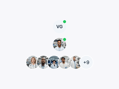
Represents a user through initials or profile imagery for identity and ownership.
Button
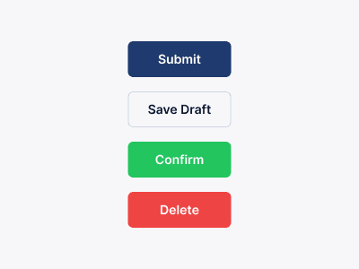
Triggers an action or event and clearly communicates user intent.
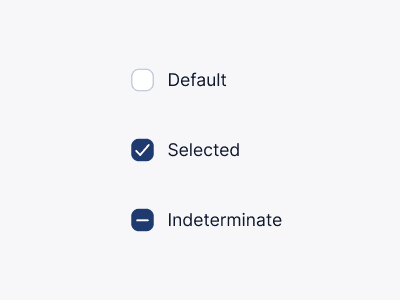
Checkbox
Allows users to select one or more options independently.
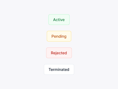
Chip
Displays compact information, tags, filters, or selected values.
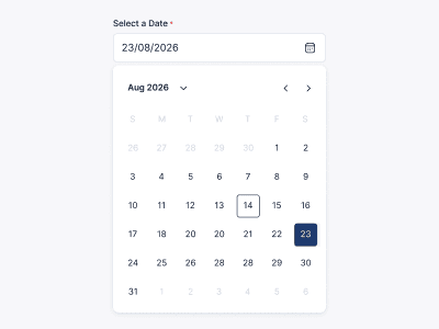
Date Picker
Allows users to select a date with a consistent interaction model.
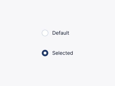
Radio
Allows users to select a single option from a group.
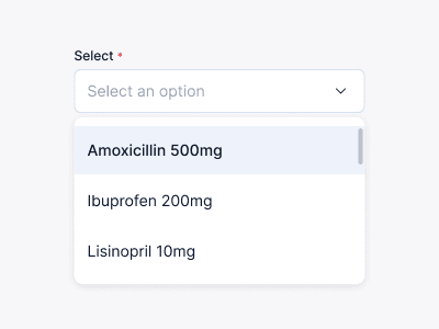
Select
Displays a dropdown list for choosing one or more options.
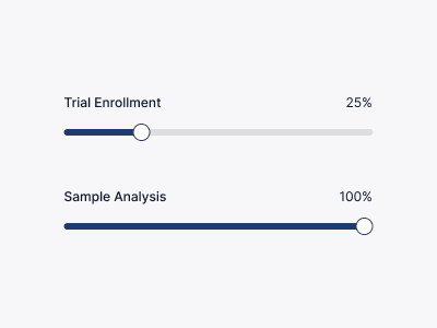
Slider
Allows users to choose a value from a continuous range.
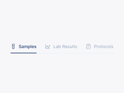
Tabs
Organizes related content into easily navigable sections.
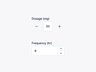
Tally Counter
Displays counts, badges, notifications, or quantitative indicators.
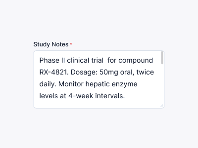
Text Area
Supports multiline text input for longer responses.
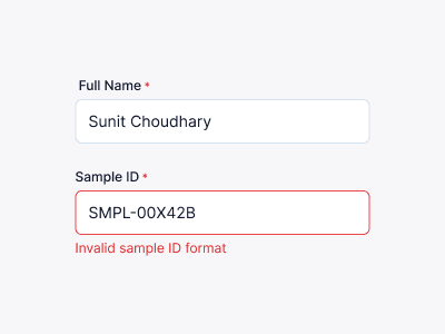
Text Field
Captures short-form user input with consistent validation and interaction states.
...and a lot more
PULSE includes many more enterprise-ready components, patterns, templates, and utilities designed to accelerate product development while maintaining consistency across the platform.
Documenting every component in Figma
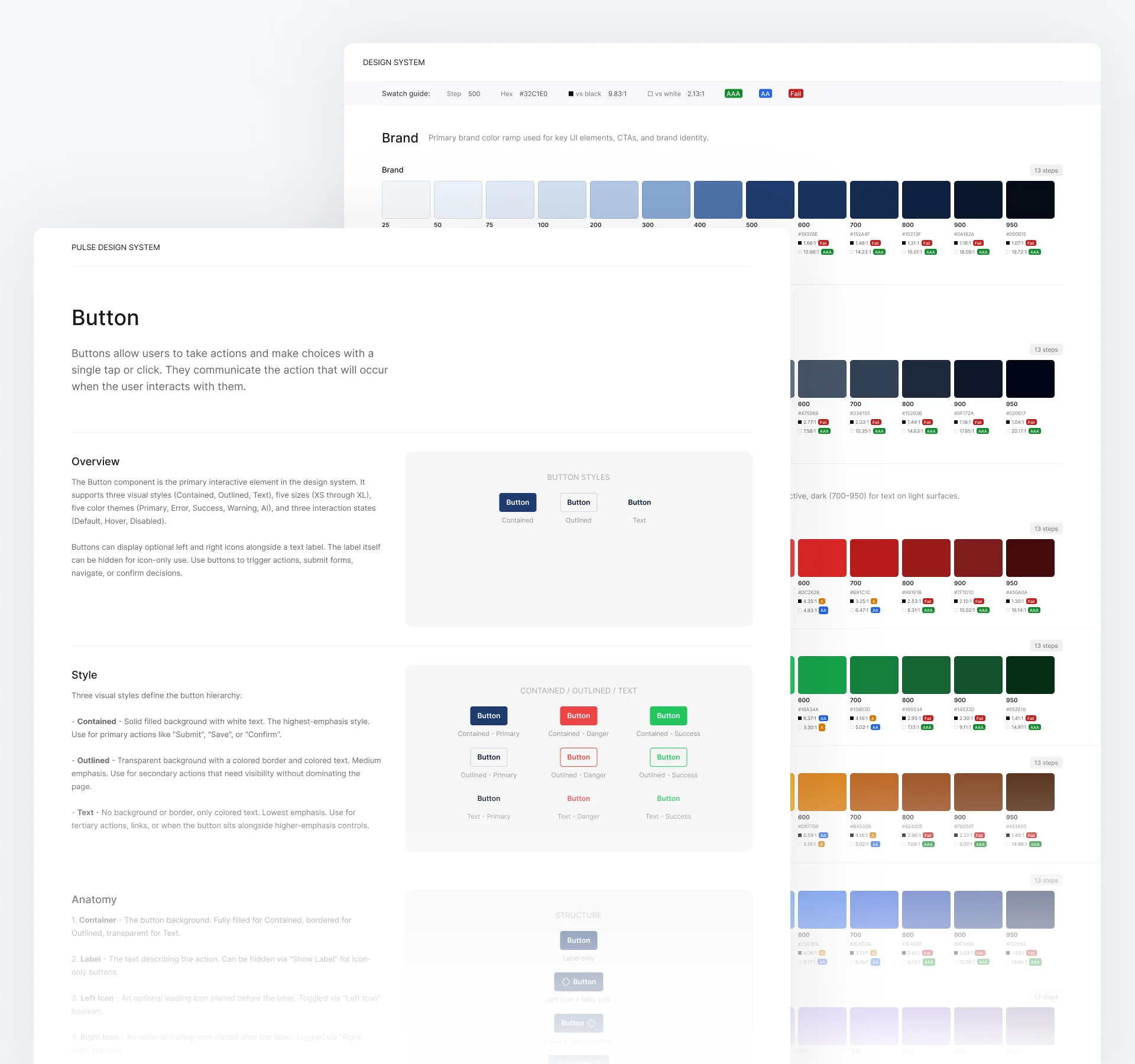
Every component in the library ships with its own page in Figma, not just the component itself. Before dropping one into a screen, a designer could open that page and see how it was built, every variant and size it came in, when to use it over something similar, and the mistakes that used to make it into design review.
Anatomy: every part of the component, named and labeled
Variants & sizes: each visual treatment and scale, shown side by side
Usage guidance: when to reach for it, and when something else fits better
Dos and don'ts: the mistakes review kept flagging, turned into a fixed rule
If a rule wasn't obvious from the page, that counted as a gap in the component, not in the documentation.
Templates & pattern library
Reusable, production-ready templates for common enterprise workflows, designed to accelerate delivery while maintaining consistency and compliance.
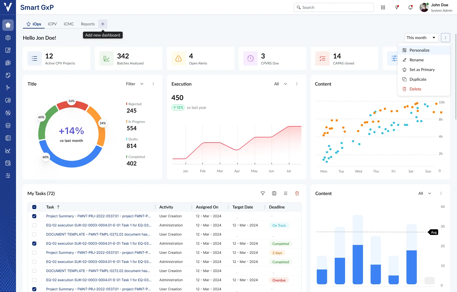
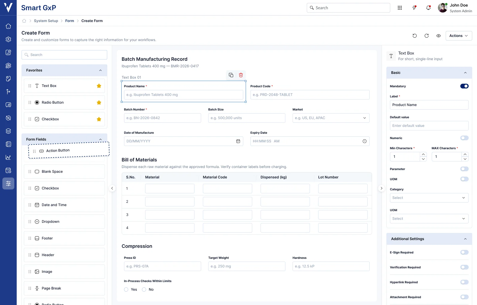
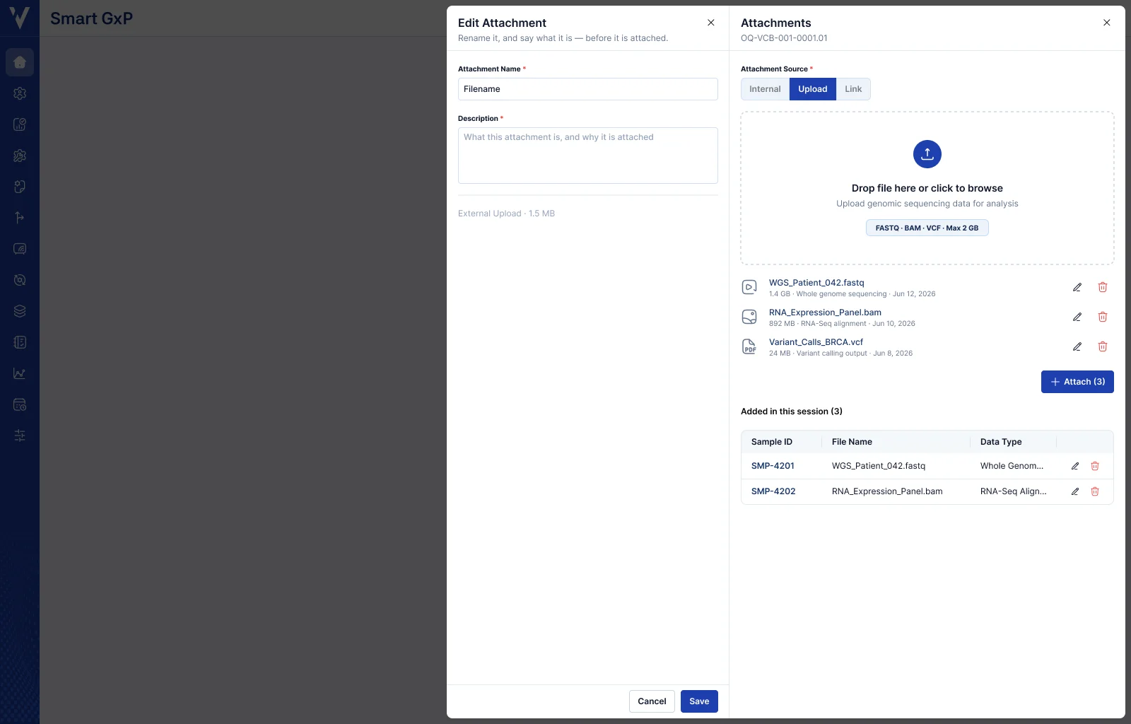
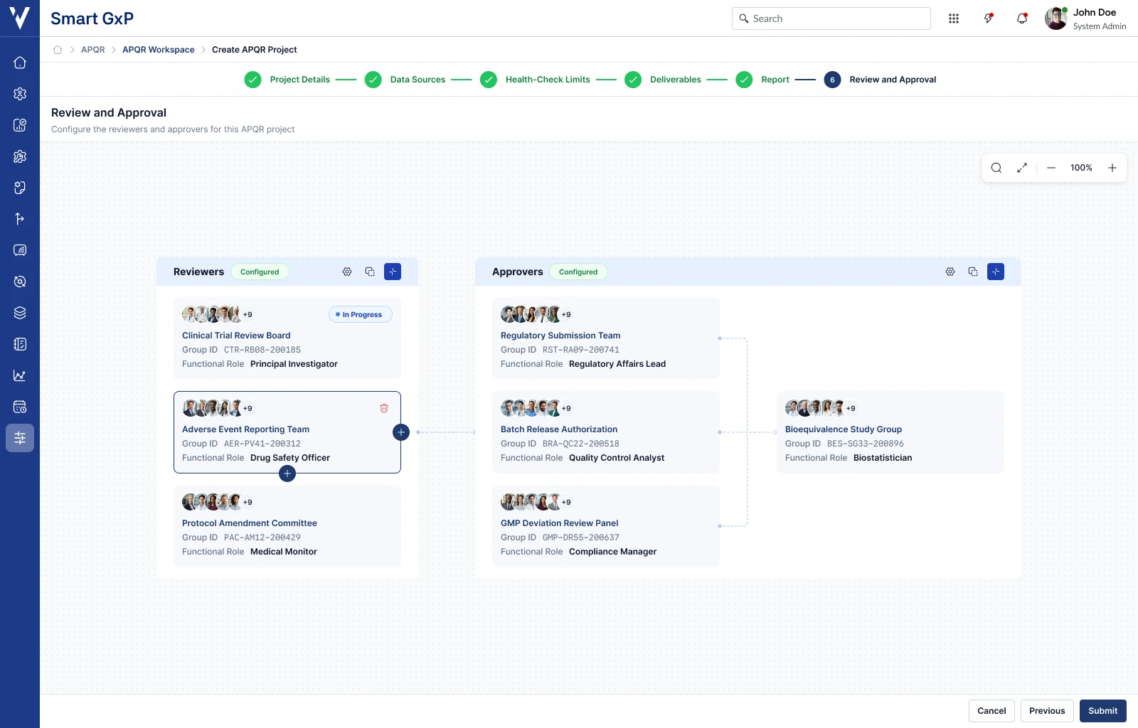
more templates
Core Page Templates
Dashboard · Canvas · Mega Page
Standardized page-level layouts for complex enterprise experiences, providing a consistent structural foundation while supporting flexibility across products and workflows.
Data & Record Management
CRUD · Metadata · Data Grid
Standardized data management layouts for complex enterprise experiences, providing a consistent interaction foundation while supporting clarity across records and workflows.
Forms & Workflow Templates
Form Builder · Workflow
Standardized workflow layouts for complex enterprise experiences, providing consistent guidance and validation while supporting simple and multi-step processes.
Overlay & Contextual
Flyout · Modal
Standardized contextual layouts for complex enterprise experiences, providing focused interactions while preserving user context and task continuity.
Compliance & Governance
Audit Trail · Audit Trail Comparison · Electronic Signature · Segregation of Duties
Standardized governance layouts for complex enterprise experiences, providing traceability and accountability while supporting regulated workflows.
UI pattern library
We documented and standardized 50+ interaction patterns and best practices that solve common UX challenges across our B2B products. These patterns ensure consistency and save teams from reinventing solutions.
Impact
The design system delivered measurable improvements across design efficiency, development velocity, product quality, and user experience.
Reflection
Designing components, templates, and interaction patterns for other designers and engineers, not just end users, taught me lessons about consistency, reuse, and documentation.
What worked well
- Starting with a token-first foundation before designing any component
- Defining every interaction state early: hover, focus, error, loading, disabled
- Building templates directly from real product screens, not generic mockups
- Documenting usage guidance alongside every component, not after it shipped
- Working closely with engineering while a component was still being defined
Challenges faced
- Designing components flexible enough for use cases that didn't exist yet
- Keeping interaction patterns consistent across very different product screens
- Knowing when to extend an existing component versus propose a new one
- Capturing every edge case a component needed to handle before engineering built it
- Balancing pixel-level consistency with the pace product teams needed to ship
What I'd do differently
- Writing usage documentation earlier, alongside the first draft of a component
- Testing components against more real product screens before calling them done
- Involving engineering earlier when defining a new interaction pattern
- Keeping a running log of edge cases surfaced during implementation
- Piloting new templates with one team before rolling them out further
PULSE started as an answer to fragmentation and became the platform the products are built on. The components were the easy part. The shared language, the governance, and the templates are what let teams stop re-solving the same problems, and what keep it evolving as the products do.