Case Study · Enterprise Dashboard
Breaking the 9-widget ceiling on the SmartGxP dashboard
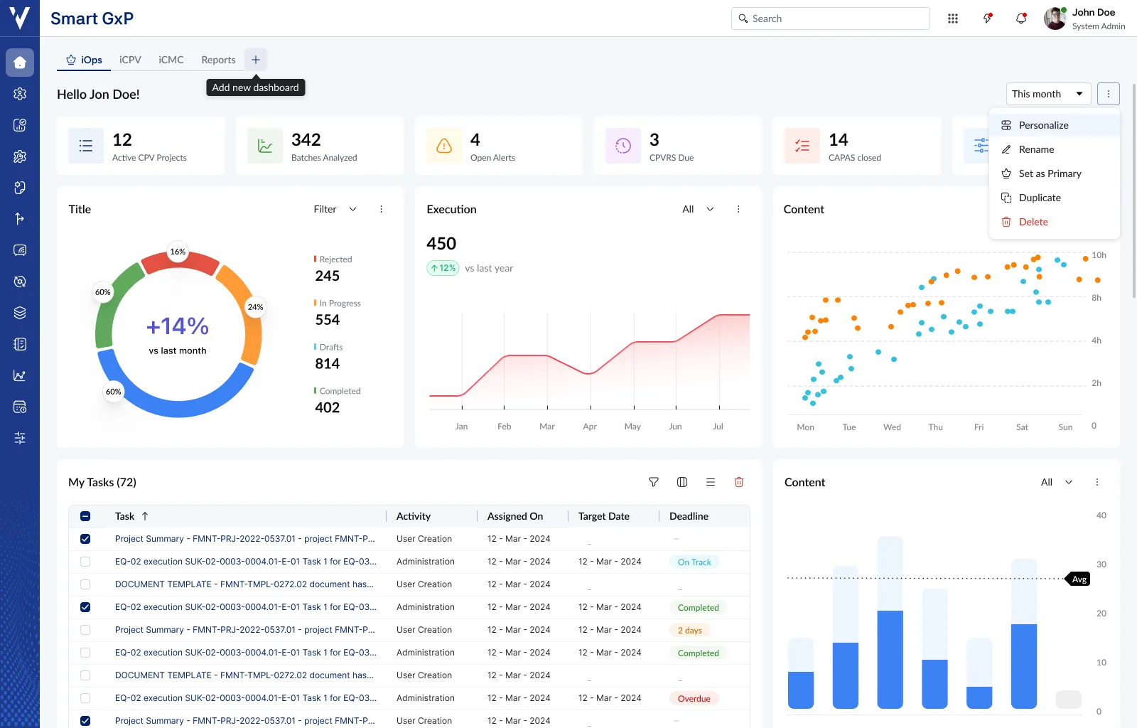
From a dashboard capped at 9 widgets on a single, locked layout to a fluid, expandable, and truly personalized workspace, built with PULSE to scale alongside a growing enterprise platform.
Project snapshot
SmartGxP is ValGenesis' next-generation digital validation platform for regulated industries, unifying operational workflows, compliance visibility, analytics, and configurable enterprise experiences into a single product. As enterprise customers scaled, the demand for flexible, data-driven experiences grew quickly, and the dashboard redesign became the proving ground for PULSE, ValGenesis' new enterprise design system.
My role: I designed the information architecture, interaction design, widget system, personalization workflows, and responsive layout, aligning each with PULSE and working closely with product managers, engineering, and design system contributors.
The dashboard worked. The ceiling didn't.
The existing dashboard was functional. The problem was it couldn't keep pace with a platform that was growing rapidly. Every new module added more pressure on an architecture never designed to expand.
9-widget ceiling
A hard limit of 9 widgets via the template selection screen meant the dashboard couldn't represent the full platform as new modules were added.
No fluid expandability
The layout system wasn't built to grow. Adding a new module meant working within a constrained template, not extending a flexible architecture.
Not responsive
Built for desktop only. Tablets and non-standard resolutions broke the experience, a growing issue as field usage increased.
Single dashboard only
Every user had one dashboard. No way to maintain separate views for daily ops, audit prep, or team reporting, or switch between them.
No widget prioritization
Users couldn't resize or rearrange widgets to reflect what mattered most. Layout order was fixed regardless of individual workflow priorities.
Inconsistent patterns
Legacy components lacked alignment, creating a fragmented visual experience before PULSE arrived as the unified design system.
Not role-aware
Every user saw the same widgets in the same positions. A QA manager and a validation specialist had identical starting points with no differentiation.
Inefficient real estate
Modules occupied fixed space regardless of user access level or how relevant the content was to that person's daily work.
Template screen capped at 9
The template selection screen was the only customization available, and with a ceiling of 9 widgets, it was already unfit for where the platform was heading.
“The dashboard worked, but the platform was growing faster than it could. The 9-widget ceiling wasn't a design choice anymore; it was a constraint.”
Project framing, SmartGxP Dashboard Revamp brief
How might we evolve the SmartGxP dashboard from a functional but capped experience into a fluid, expandable, and truly personalized workspace: one that scales with the platform, supports 50+ widgets, and gives users the flexibility to prioritize what matters most to their role?
Understanding users before designing for them
Discovery was grounded in stakeholder discussions and structured product analysis. Several recurring themes directly shaped the design direction from the outset.
Key observations
The 9-widget cap was the primary constraint
As new modules were added to SmartGxP, the ceiling made it impossible to give users visibility across the full platform. The architecture needed to be uncapped and fluid.
One dashboard for everyone wasn't enough
A QA manager's audit-prep dashboard looks nothing like a validation specialist's daily ops view. A single shared structure couldn't serve both well.
Layout order didn't reflect priority
Users couldn't resize or reorder widgets to bring what mattered most to the top. True personalization means controlling not just which widgets appear, but how prominently.
Template selection was the only customization
The existing template screen gave a starting point but no ongoing control. Once selected, the layout was effectively locked: no fluid rearrangement, no resizing.
Platform growth made the gap widen over time
Every new module added pressure. Each one wanted dashboard representation but the architecture had no room. The gap between what the platform offered and what the dashboard showed kept growing.
Business goals
- Support the growing SmartGxP ecosystem within ValGenesis
- Increase engagement with dashboard widgets
- Improve discoverability of platform modules
- Create a scalable foundation for future expansion
- Standardize experiences using PULSE
User goals
- Quickly access important tasks and modules
- Personalize the dashboard based on workflow needs
- Reduce navigation effort and repetitive clicks
- Get better visibility into priorities and status
User personas
Four distinct user types with entirely different daily needs, the finding that drove full personalization.
QA Manager
Compliance oversight, validation, audit readiness
Goals
- Monitor pending validations
- Review compliance metrics
- Ensure audit readiness
Pain points
- Critical actions buried in noise
- Repeated module-hopping
- No central team status view
Dashboard priorities
Validation Specialist
Workflow execution, documentation, daily tasks
Goals
- Access assigned work quickly
- Track deadlines
- Minimize repetitive navigation
Pain points
- Dashboard felt disconnected from daily work
- Template showed irrelevant information
- Too many clicks to reach modules
Dashboard priorities
Compliance Auditor
Records, validation status, process compliance
Goals
- Quickly assess compliance health
- Review audit trails
- Identify pending risks
Pain points
- Fragmented information architecture
- Inconsistent reporting visibility
- Difficult-to-scan data structures
Dashboard priorities
Department Head
High-level visibility, KPIs, operational trends
Goals
- Monitor team performance
- Identify delays and risks
- Track KPIs and trends
Pain points
- Too much operational detail
- Hard to scan for insights quickly
- Weak visual prioritization
Dashboard priorities
Key insight
The existing dashboard worked, but it couldn't scale. The 9-widget ceiling, single layout, and lack of rearrangement meant users were operating within a system that couldn't reflect their actual priorities, and would only fall further behind as SmartGxP grew.
User journey map
How users move through SmartGxP, and how the PULSE dashboard addresses friction at each stage.
Login & Entry
Quickly understand priorities · Access dashboard after login
Pain point
Template showed irrelevant widgets
PULSE opportunity
Personalized dashboards surface relevant KPIs
Task Discovery
Identify pending work · Scan for tasks, approvals, alerts
Pain point
Information scattered across modules
PULSE opportunity
Centralized task widgets improve discoverability
Navigation
Access required modules quickly · Move between workflows and modules
Pain point
Multiple clicks and repetitive navigation
PULSE opportunity
Quick-access widgets reduce friction
Monitoring
Track compliance and health · Review charts, KPIs, reports
Pain point
Weak visual hierarchy, hard to scan
PULSE opportunity
Modular widgets with improved readability
Customization
Configure workspace by role · Add, remove, and rearrange widgets
Pain point
Template only: max 9 widgets, locked after setup
PULSE opportunity
Editable dashboards: rearrange and resize freely
Collaboration
Coordinate with teams · Review approvals and workflow updates
Pain point
Limited contextual visibility into team activity
PULSE opportunity
Unified dashboards improve operational awareness
Cross-Device
Access across screen sizes · Use platform on desktop and tablet
Pain point
Dashboard responsiveness was inconsistent
PULSE opportunity
Responsive PULSE grid improves usability
Ongoing Use
Build efficient repeat workflows · Use dashboard daily for operations
Pain point
Dashboard could not scale with more modules
PULSE opportunity
Modular layouts support long-term scalability
Six principles behind every decision
Aligned on before moving to wireframes, the decision-making framework used throughout the entire project.
P01
Modular by default
Every section behaves independently and scales without redesigning the entire dashboard. Widgets are the atomic unit.
P02
Personalized experience
True personalization means rearranging and resizing, not just choosing which widgets appear. Priority is the differentiator.
P03
Safe to customize
Users only rearrange when they trust they can't break anything. Edit mode is explicit, destructive actions confirm first, and unsaved work is never lost silently.
P04
Action-oriented
The dashboard helps users act faster, not just consume information. Every widget earns its place through utility.
P05
Scalable architecture
Built for modules that don't yet exist. New modules add a widget; they don't require a redesign. Target: 50-60 widgets.
P06
Consistent through PULSE
Every component uses PULSE. The dashboard is the flagship PULSE implementation inside SmartGxP.
Restructuring the information space
The dashboard was reorganized into clearly defined zones, each with a distinct purpose, replacing a single undifferentiated layout with a coherent, navigable structure.
SmartGxP Dashboard: IA map · 7 layers · 35+ nodes
Global Navigation
Entry points shared across the whole platform, always in view.
Module nav, Notifications, User profile, Dashboard switcher
Dashboard Controls
Per-dashboard actions for configuring and managing the current view.
Date filters, Edit dashboard, Widget management, Duplicate / delete, Set as primary
KPI & Summary Zone
At-a-glance health metrics surfaced above the fold.
Compliance, Validation status, Inventory, Completion KPIs
Widget Grid: Visualizations
Charting widgets for trends and comparative data.
Bar charts, Pie / donut, Line charts, Radar / heatmap
Widget Grid: Operational
Task-facing widgets for day-to-day operational work.
Task list, Calendar, Activity feed, Alerts
Task Management Layer
The connective layer between dashboard visibility and real work items.
Assigned tasks, Upcoming tasks, Overdue items, Approvals, Workflow
Dashboard Personalization Layer
The layer that makes everything above it configurable per user.
Add, Remove, Rearrange, Resize, Save, Up to 5 dashboards
Module widgets at launch
From blank canvas to system
The design moved through three phases: breaking the widget ceiling with a fluid architecture, building the personalization model, and enabling full dashboard creation flows, each building on the last.
The dashboard became the first major PULSE implementation, proving the system in production while helping define it. Several components (widget API, drag-handle patterns, activity feed) were first built here, then back-ported into PULSE itself.
What PULSE contributed
Design Decision: Dashboard Limit
Users can create a maximum of 5 dashboards
In the PULSE version, each user can maintain up to 5 dashboards. This is a deliberate upper limit, not a technical one. Unlimited dashboards creates its own management problem: stale layouts, lost context, an unwieldy switcher. Five covers the realistic range of role contexts while keeping the experience governable.
Old dashboard
1
Single dashboard, template-based, max 9 widgets
PULSE dashboard
Up to 5
Per-user dashboards, fully configurable layouts
Responsive grid behavior
Responsiveness was a baseline constraint from day one. On tablet and mobile, available space limits widgets to one per row; stacking side-by-side is not viable at those widths.
Desktop
Editable1280px+
Multi-column · fully editable
Tablet
View only768-1024px
1 widget/row · view only
Mobile
View only≤767px
1 widget/row · view only
Design Decision: Responsive Personalization
Personalization is disabled on tablet and mobile
Dashboard editing is a desktop-only feature. On tablet and mobile, the dashboard is read-only. Two reasons drove this: the drag-and-drop and resize interaction model doesn't translate well to touch at small widths, and with only one widget per row there is no multi-column layout to personalize. The customization has no meaningful visual output for the user on those breakpoints.
Scalability Requirement
Designed for 50-60 widgets in the future
The SmartGxP platform is expected to grow to 50-60 distinct widgets as new modules are added. The searchable widget library was designed to remain usable whether the library contains 10 widgets or 60. A new module adding a widget should require zero redesign.
New dashboard creation flow
Creating a dashboard is a guided single-panel flow. Users never leave the main canvas; a right-side drawer handles all configuration while the grid preview updates live.
Empty canvas
Dashed grid cells signal available space. "New Dashboard" opens the right panel.
Name & set primary
User enters a name and toggles "Set as Primary", pre-filled "My Dashboard" by default.
Select widgets
Searchable widget list with filter icon. Each row has a drag handle and an info icon.
Drag to position
Widgets dragged onto grid. A "widgets will shift down" tooltip confirms collision-aware placement.
Preview & submit
Widget preview card appears before confirming. Cancel / submit footer completes the flow.
“New Dashboard” panel anatomy
Dashboard Name field
Required input, pre-filled "My Dashboard"
"Set as Primary" toggle
On by default for the first dashboard a user creates
"Select Widgets" section
Search bar and filter icon immediately below the header
Widget rows: drag handle + info
Drag handle on the left, info icon on the right of each row
Widget preview card
Appears once a widget is selected, confirming the choice before submit
Cancel / Submit footer
Sticky at the bottom of the panel at all times
Widget management UX decisions
Progressive disclosure
Advanced actions like edit, duplicate, and delete are hidden under contextual menus, reducing clutter during normal use.
Side panel editing
Dashboard configuration in a right-side drawer maintains context while the grid updates live beneath it.
Search-first widget library
Essential as the library scales to 50-60 widgets. Browsing a flat list without search at that volume would be unusable.
Empty state handling
Placeholder grid cells help users understand available space, especially important on first use before any widgets are added.
Explicit edit mode
A deliberate mode for customization rather than always-on drag-and-drop. Prevents accidental rearrangement during regular workflow.
Confirmation patterns
Critical actions like delete use confirmation modals with contextual warnings to prevent irreversible accidental changes.
The hard problems beneath the surface
A configurable enterprise dashboard introduced significant interaction and system edge cases, each requiring deliberate design decisions, not just engineering fixes.
Problem
During drag-and-drop, widgets could overlap existing ones or disrupt the grid, creating broken layouts and inaccessible content.
Solution
- Grid-based placement with automatic collision detection
- Snap-to-grid with reserved layout spacing
- "Widgets will shift down" tooltip communicates push behavior live during drag
- Blocked invalid drop zones with visual indicators
Outcome
Users could confidently rearrange without breaking dashboard structure.
Using AI to handle complexity at scale
As the dashboard became highly modular and customizable, interaction complexity grew significantly. AI-assisted workflows accelerated exploration and edge-case validation before development.
Prototyping
Figma Make
Used to rapidly experiment with interactive concepts, dashboard structures, and widget behavior in motion, far beyond what static wireframes could communicate.
UX Logic
Claude
Used to explore logic flows, edge-case scenarios, interaction patterns, and scalable dashboard behavior, particularly around permission-based rendering and state management.
Ideation
ChatGPT
Used to brainstorm UX flows, identify usability gaps, simulate user scenarios, and accelerate product thinking around personalization and system scalability.
Rapid prototyping
Prototypes generated much faster, letting the team visualize complex interactions earlier and align stakeholders before development began.
Edge case discovery
Faster identification of widget overlap, broken layouts, inaccessible widgets post permission change, and unexpected empty states.
Design-to-dev clarity
Reduced ambiguity before implementation, especially how widgets behave when resized, rearranged, or dynamically loaded across breakpoints.
Key reflection
Rather than replacing the UX process, AI acted as an accelerator for experimentation and systems thinking, allowing the team to explore interactions that static deliverables couldn't adequately communicate to engineering.
The transformation at a glance
| Dimension | Legacy dashboard | PULSE dashboard |
|---|---|---|
| Layout model | Template-based: layout locked after setup, no rearranging | Fluid PULSE grid: drag to rearrange, resize by priority, snap-to-grid |
| Personalization | Template screen gave a starting point; no rearrange or resize after | True personalization: resize and reorder to reflect what matters most |
| Dashboard count | Single dashboard: no creation, switching, or role-based separation | Up to 5 named dashboards per user: daily ops, audit prep, team KPIs etc. |
| Widget cap | Hard ceiling of 9 widgets via template screen | No cap; widget library built to scale to 50-60 modules |
| Module coverage | Fixed widgets for legacy modules only | Adhoc Reports, Task List, Content, Calendar, Inventory, Execution, Assessment, Project + extensible API |
| Responsiveness | Desktop only: breaks on tablet and mobile | Fluid grid; 1 widget/row on tablet and mobile; edit mode desktop-only by design |
| Role awareness | No concept of user role or permission | Permission-gated widgets, role-based default suggestions |
| Scalability | New modules require full dashboard work to add | Widget API built for 50-60 widgets; new modules add a tile, not a redesign |
| Error handling | Page-level failures for any widget error | Isolated widget failures, skeleton states, retry options |
| Design system | Legacy ad hoc components, visually inconsistent | 100% PULSE, zero legacy exceptions |
Evaluating the redesign honestly
Strengths
- Modular widget architecture scales with the product
- True personalization: resize and reorder by priority
- Scalable foundation ready for 50-60 future modules
- Strong alignment with PULSE design system
- Better information hierarchy and discoverability
Weaknesses
- Increased complexity in dashboard management UX
- Advanced customization requires some user onboarding
- Higher engineering effort for full configurability
- Large enterprise data density still challenging
- Widget overload possible without governance guardrails
Opportunities
- Future AI-driven personalization and widget recommendations
- Role-based dashboard templates and team sharing
- Advanced analytics and reporting widgets
- Cross-platform responsive experiences
- Reusable framework across ValGenesis products
Threats
- Over-customization may create inconsistent experiences
- Rapid product expansion could increase complexity
- Legacy modules may not align fully with new architecture
- User resistance to changes in established workflow habits
- Enterprise performance concerns with dynamic widgets
What the redesign changed
The redesign evolved the SmartGxP dashboard from a functional but constrained experience into a fluid, expandable workspace. Breaking the 9-widget ceiling was the foundation; multiple dashboards, role-based defaults, and true layout personalization were the layers built on top.
Ceiling broken
From a hard cap of 9 widgets to an unlimited, scalable widget architecture built for 50-60 modules and beyond.
True personalization
Users can now resize and reorder widgets to reflect their actual priorities, not just choose which ones appear.
Multiple dashboards
Up to 5 named dashboards per user: separate views for daily ops, audit prep, team reporting, and more.
Platform scalability
New SmartGxP modules can be added to the dashboard with zero redesign, just a new widget in the library.
Responsive experience
Fluid grid across all breakpoints. 1 widget per row on tablet and mobile with read-only mode by design.
PULSE flagship
100% PULSE components throughout. The dashboard became the first and flagship implementation of the design system.
What this project reinforced
Building a configurable enterprise dashboard reinforced how much of the work was about constraints, priority, and designing for a scale the platform hadn't reached yet.
The constraint was the ceiling, not the concept.
The old dashboard worked. The 9-widget cap and single locked layout were the real blockers, and removing that ceiling is what unlocked everything else.
Personalization is about priority, not presence.
Choosing which widgets appear is a starting point. Resizing and reordering them is what actually reflects how someone works.
Multiple dashboards solve the role problem cleanly.
Five named dashboards let a QA manager keep audit prep separate from daily ops, instead of forcing one screen to serve every context.
Responsiveness meant knowing what to leave out.
With one widget per row on tablet and mobile there is no layout left to personalize, so disabling edit mode there was the right call rather than a compromise.
Scalability has to be built in, not bolted on.
The widget API and fluid grid were designed for 50-60 widgets from day one, so a new module adds a tile instead of triggering a redesign.
Design systems amplify scalability.
PULSE turned a one-off redesign into a foundation every later screen builds on without drift.
AI accelerated the right things.
It shortened the gap between "what happens when X" and a concrete interaction, especially for edge cases static screens couldn't communicate to engineering.
Explicit edit mode builds trust.
A deliberate customization mode let users rearrange their layout without fear of breaking it during regular work.
The SmartGxP Dashboard Revamp wasn't about fixing something broken. It was about breaking a ceiling: moving from a functional but constrained experience to one fluid enough to grow with the platform, flexible enough to reflect individual priorities, and scalable enough to still make sense at 50+ widgets.